Harajuku Rebrand
For a school assignment, we were tasked with selecting a city, region, or area and making the choose of rebranding it. I chose Harajuku in Japan, a vibrant epicenter of culture. For this project, I focused on transforming the original Japanese characters in a way that was recognizable yet unique. Harajuku is also a place where electric and neon signs are everywhere, so I chose to stick with a neon feel for the colors and textures.
Harajuku Brand Manual
The second portion of this project involved designing a brand manual for the new brandmark. I focused on keeping the integrity of the design through black pages, neon imagery, and a choice in having the brand manual be in both English and Japanese.
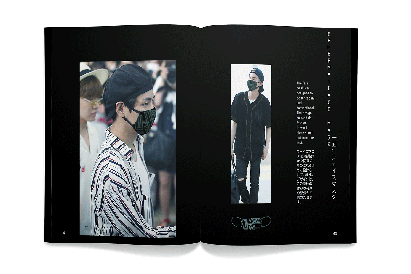
Within the manual, I also covered various methods to using the brand such as on face masks and fans. I also designed a neon sign for the area of Tokyo along with a branded map that could be found at the train stations.
Neon Sign Design in Manual
Facemask Design in Manual
Brand on Fan
Branded Map Design


